← Back to portfolio

L'Aube d'Or

“Cold-saponified, scented with sunshine.”

A fictional project: the identity of an artisan soap workshop in Provence. The logo reflects the name: a sun rising behind a sprig, olive for the Olive range, lavender for the Lavande range. The golden ochre evokes the light and earth of the South. Paired with deep black and an elegant typeface, it gives the brand a handcrafted, premium feel. The identity is then rolled out across every medium, from print to social media.

Client

L'Aube d'Or soap workshop (fictional brand)

Sector

Artisan cosmetics, Provençal soaps

Services

Logo, brand guidelines, print, social media

Tools

Illustrator, Photoshop · 2025

Visual identity
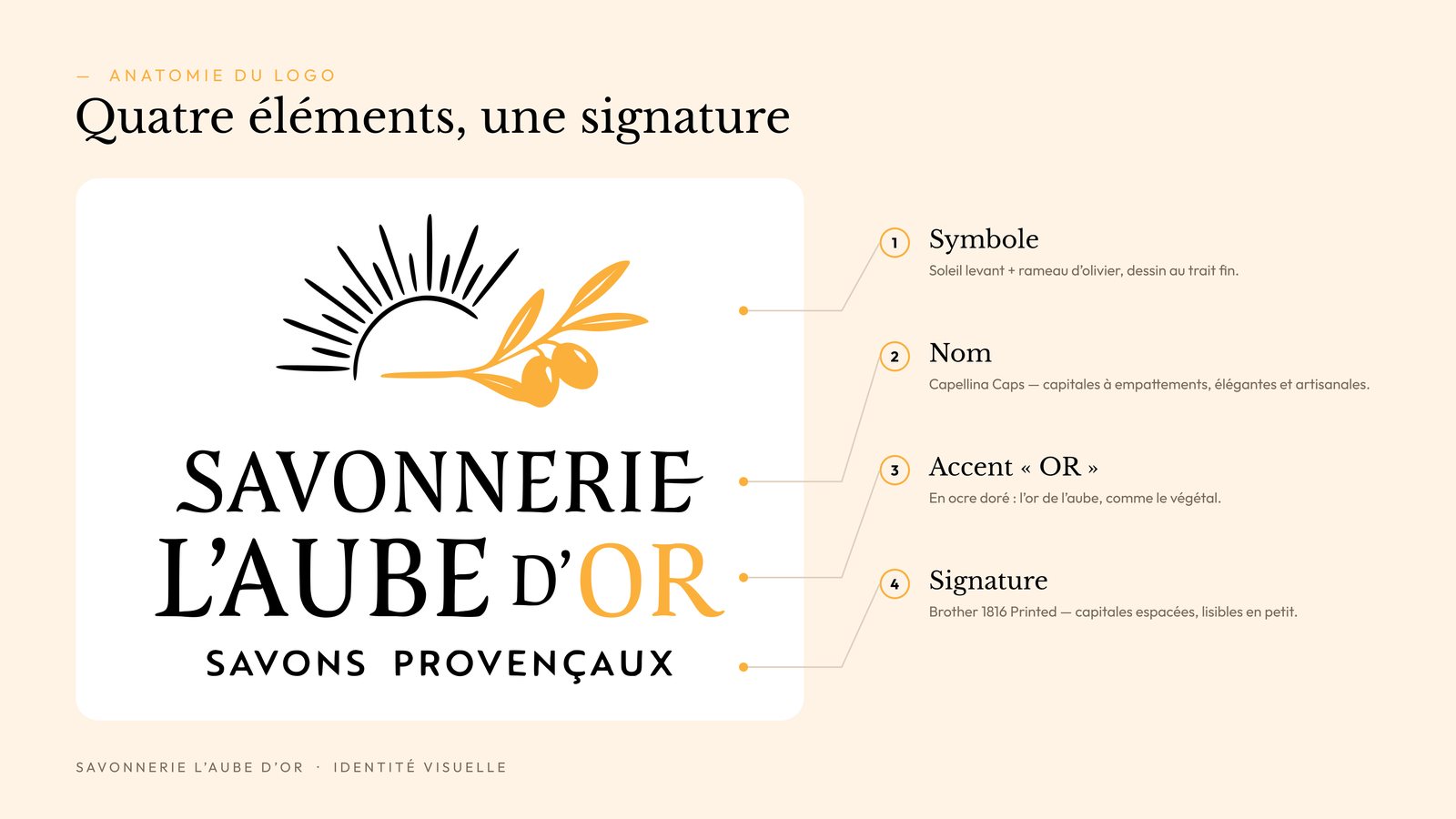
L'Aube d'Or logo anatomy: sun and olive sprig symbol, name, OR accent and the signature Savons provençaux

Logo anatomy

Two ranges, one signature
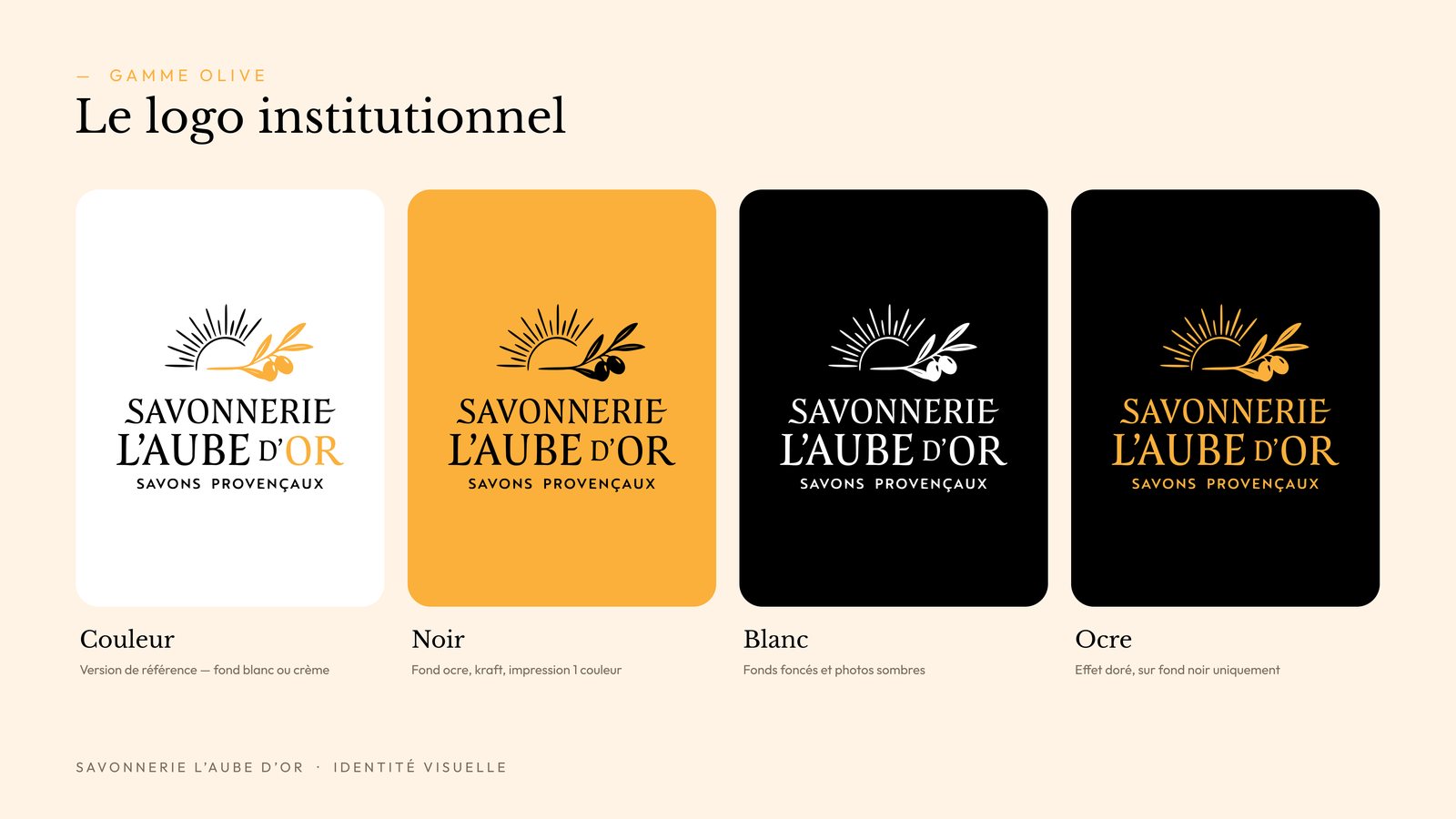
Olive range logo in four versions: colour, black, white and ochre
Olive range

Lavande range logo in four versions: colour, black, white and ochre

Lavande range

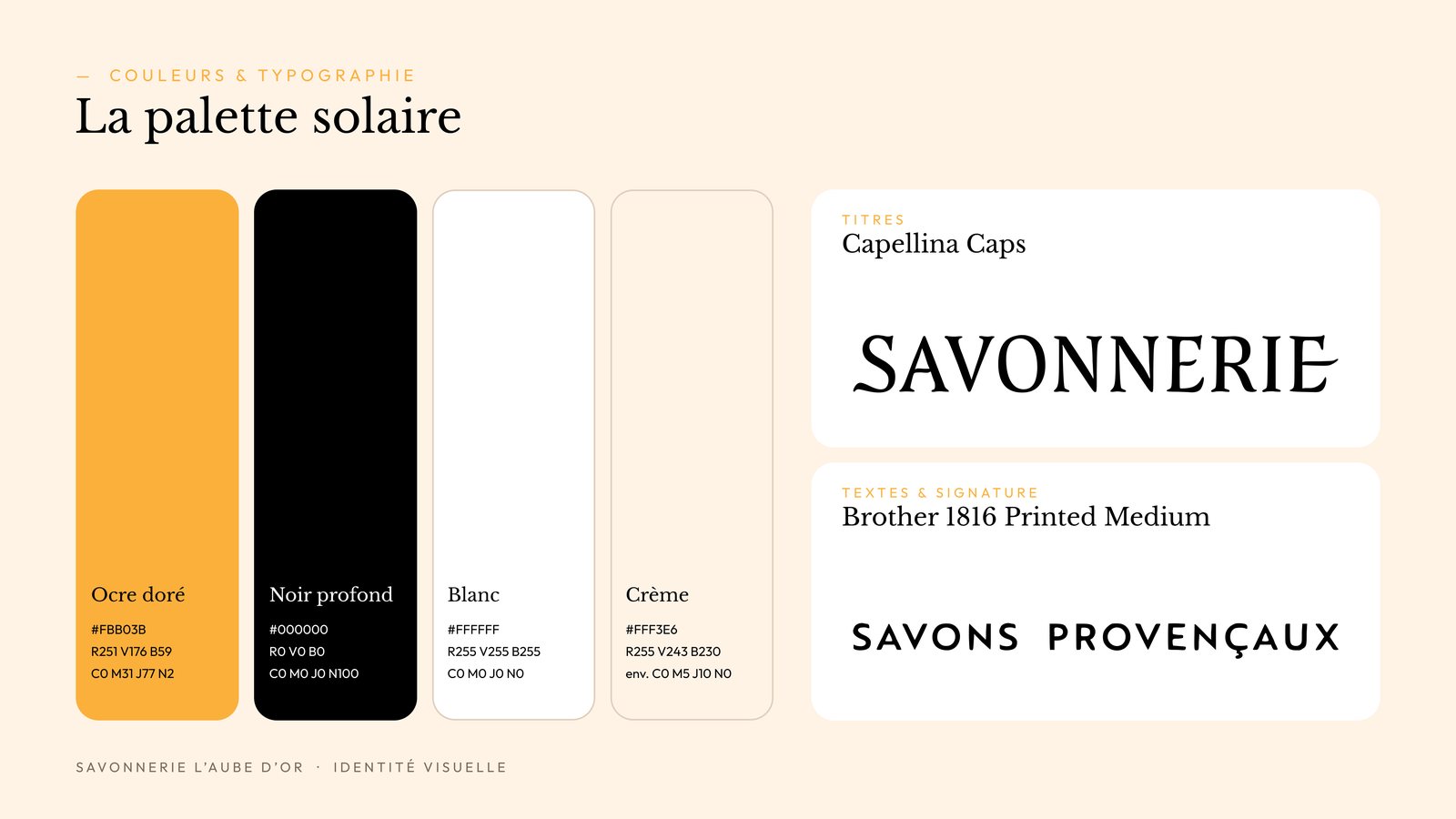
Solar palette of golden ochre, black, white and cream, with Capellina Caps and Brother 1816 typefaces

Colours & typography

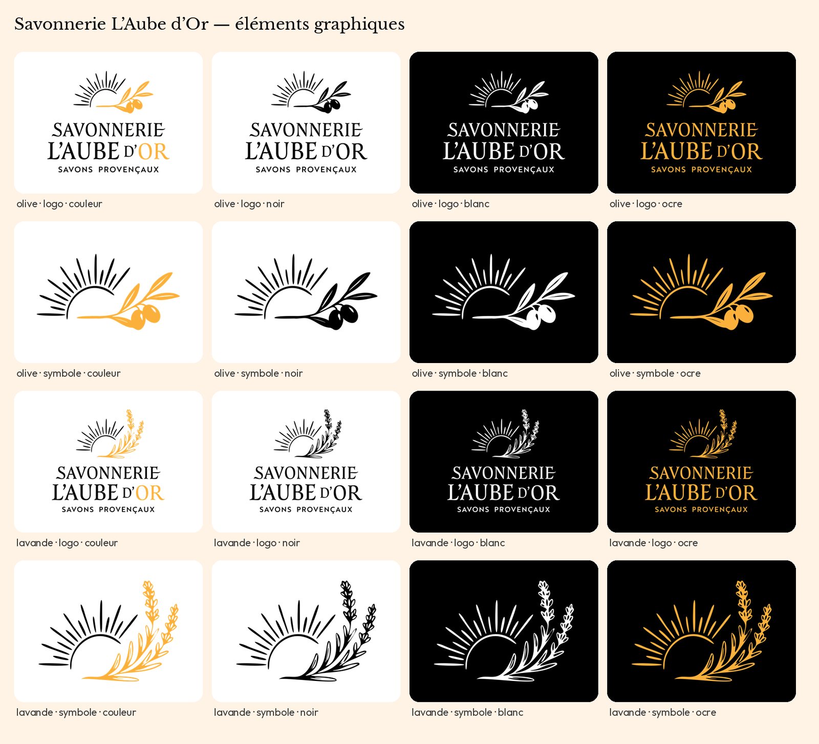
Sheet of all logo and symbol variations, Olive and Lavande ranges

All variations

Social media
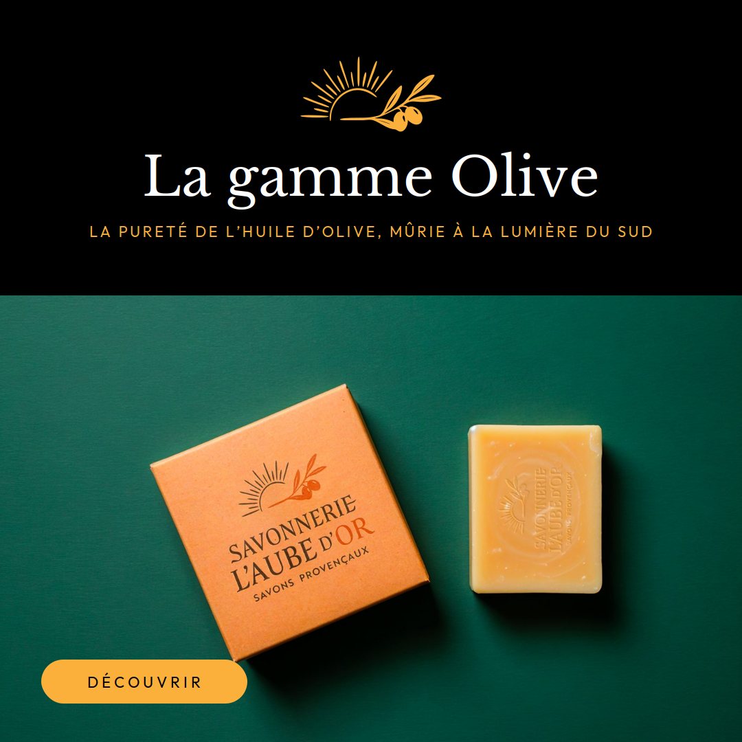
Instagram post “The Olive range”: soap and ochre box on a green background

Post · Olive range

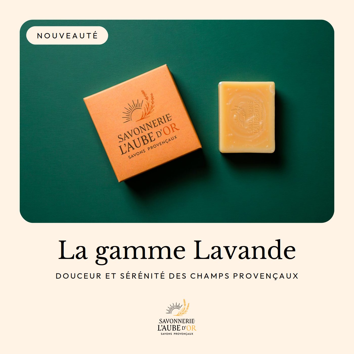
Instagram post “New: the Lavande range”

Post · Lavande range

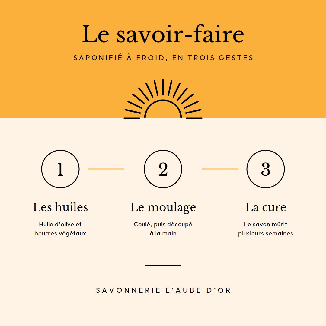
Instagram post “Our craft”: the oils, the moulding, the curing

Post · Craft

Print & web
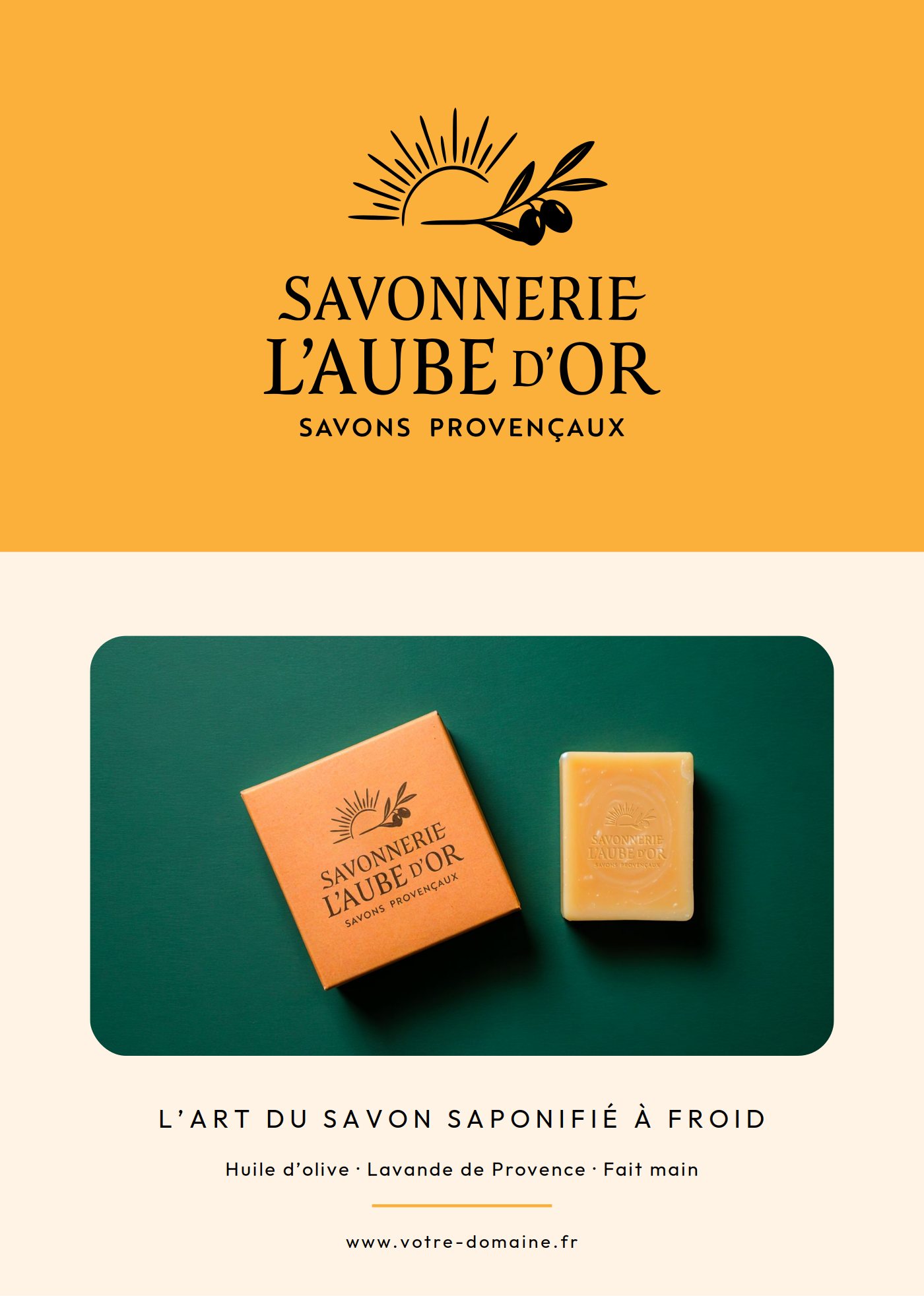
A5 flyer for L'Aube d'Or: logo on an ochre background and product photo

Flyer A5

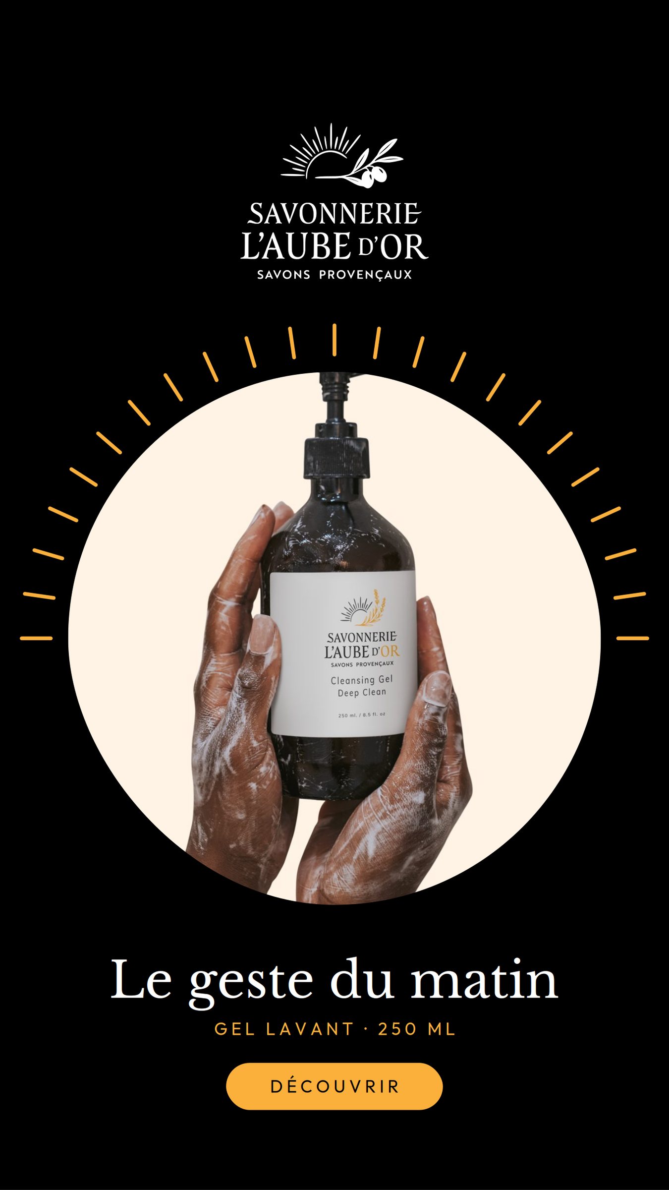
Story “The morning ritual”: bottle of wash gel held in two hands, radiant sun

Product story

Stationery & variations
Business card front, logo on a cream background

Business card · front

Business card back on a black background, founder's contact details

Business card · back

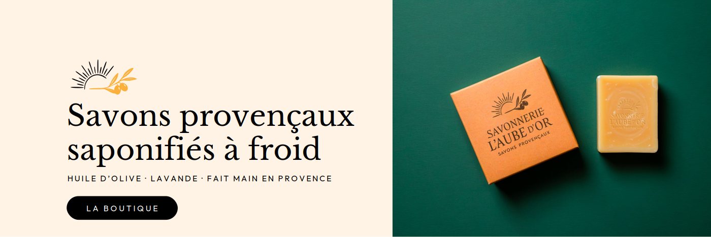
Web banner “Cold-saponified Provençal soaps”

Web banner

Round ochre sticker with the L'Aube d'Or logo

60 mm sticker