← Back to portfolio
L'Aube d'Or
“Cold-saponified, scented with sunshine.”
A fictional project: the identity of an artisan soap workshop in Provence. The logo reflects the name: a sun rising behind a sprig, olive for the Olive range, lavender for the Lavande range. The golden ochre evokes the light and earth of the South. Paired with deep black and an elegant typeface, it gives the brand a handcrafted, premium feel. The identity is then rolled out across every medium, from print to social media.
Visual identity
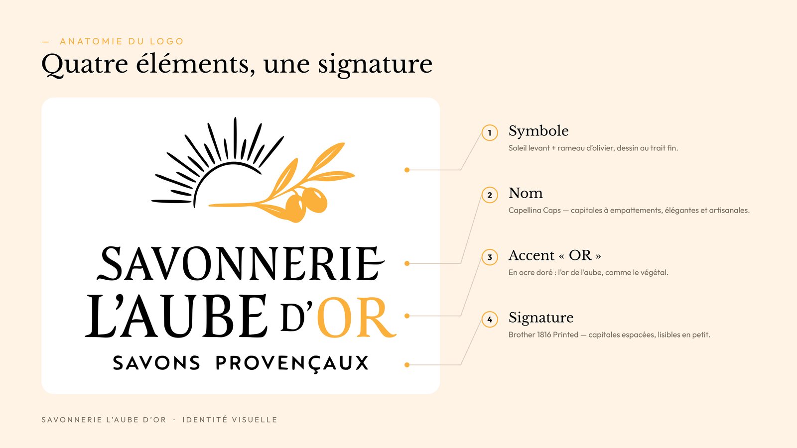
Logo anatomy
Two ranges, one signature
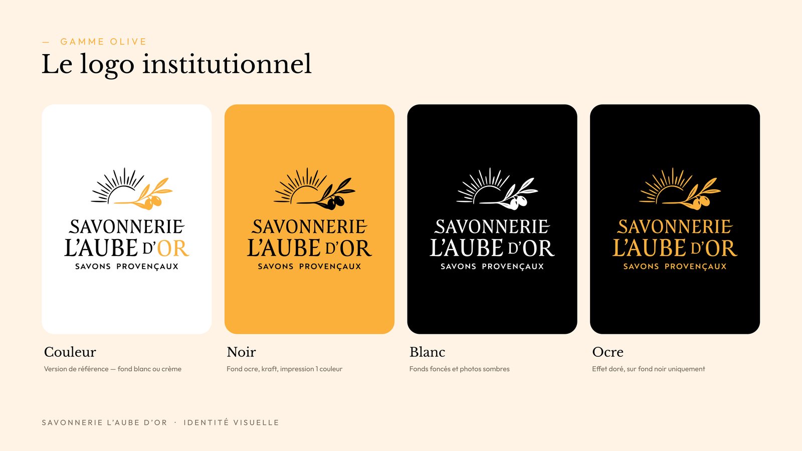
Olive range
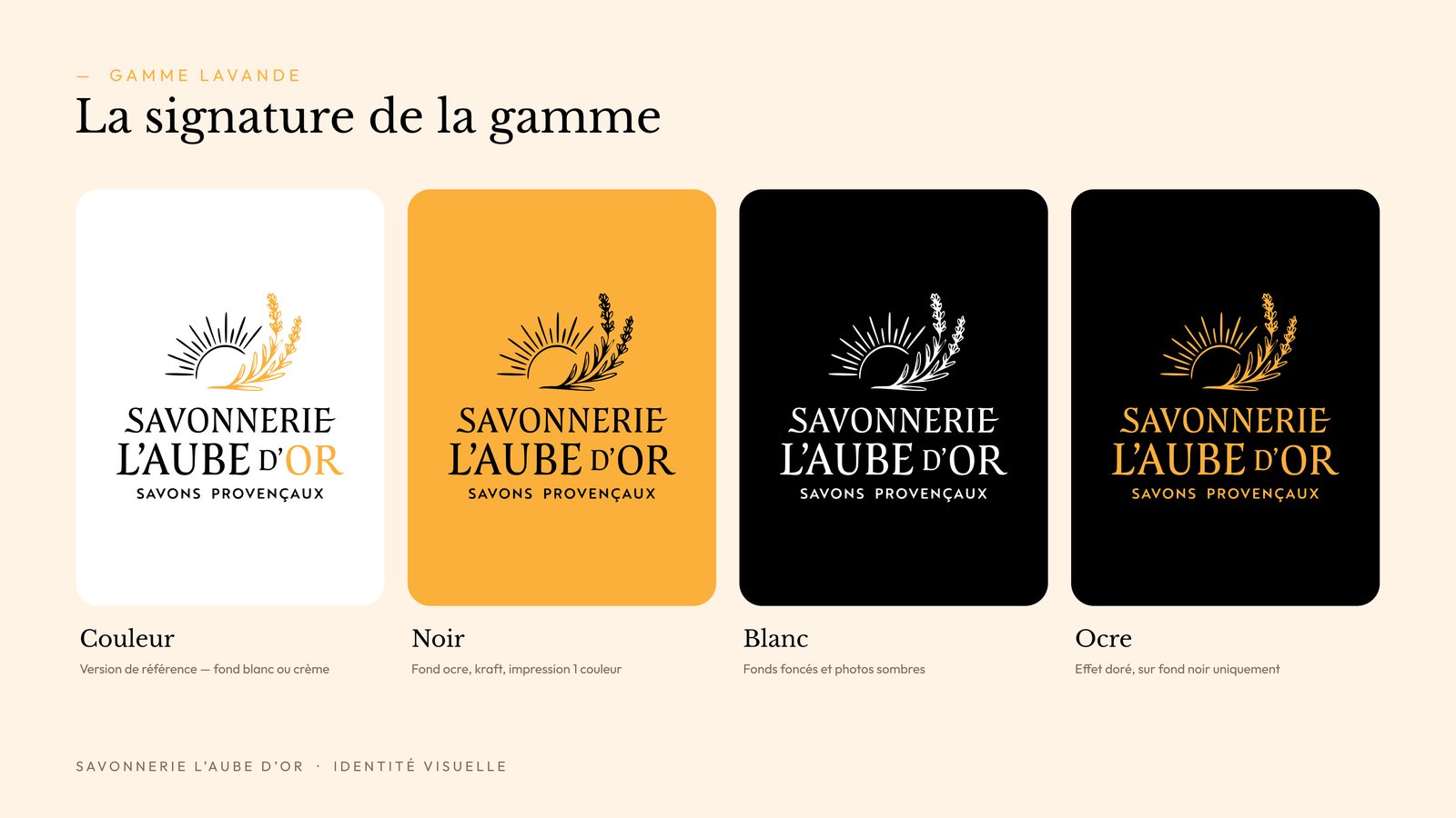
Lavande range
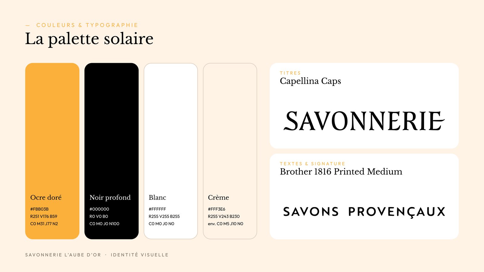
Colours & typography
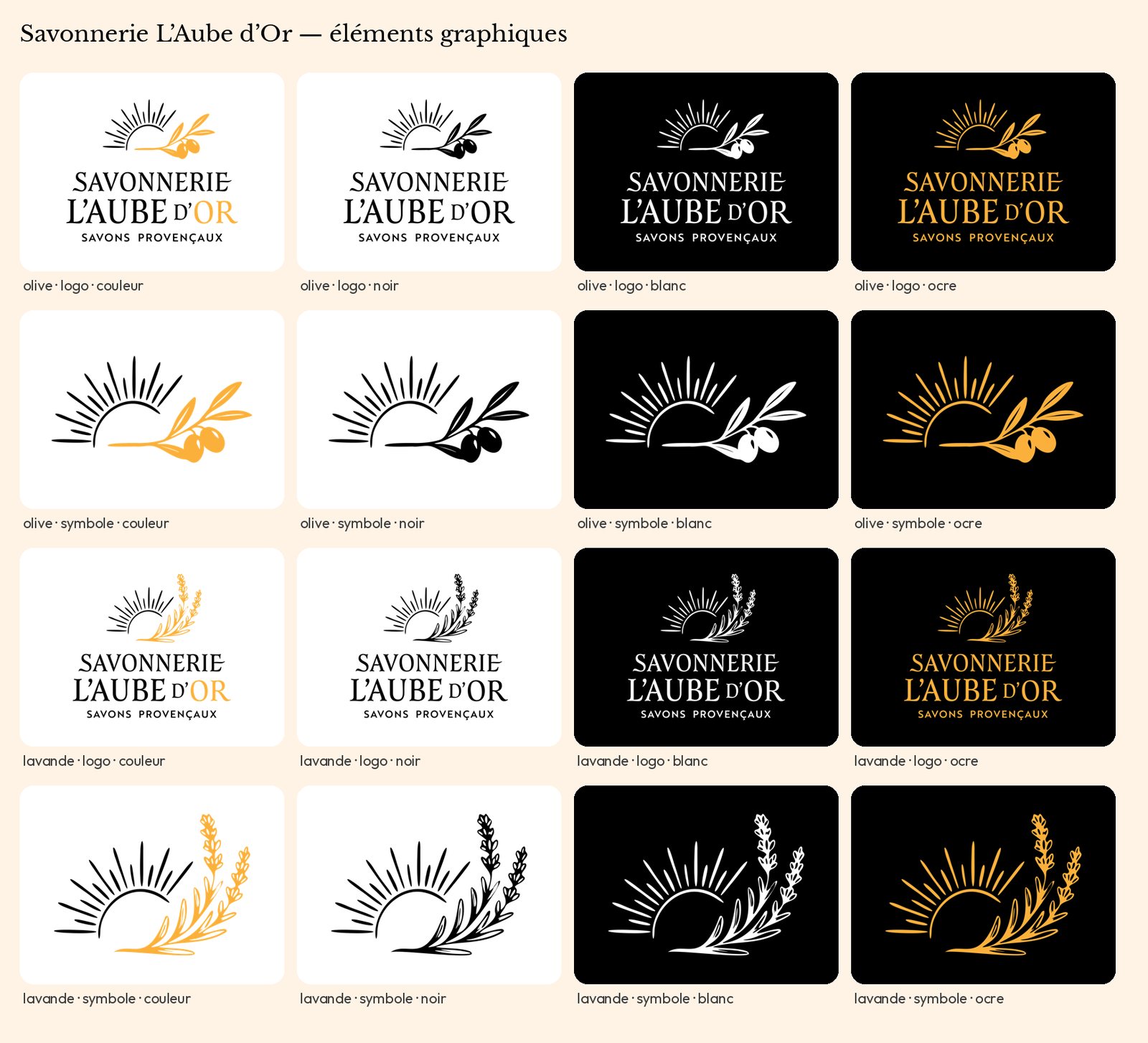
All variations
Social media
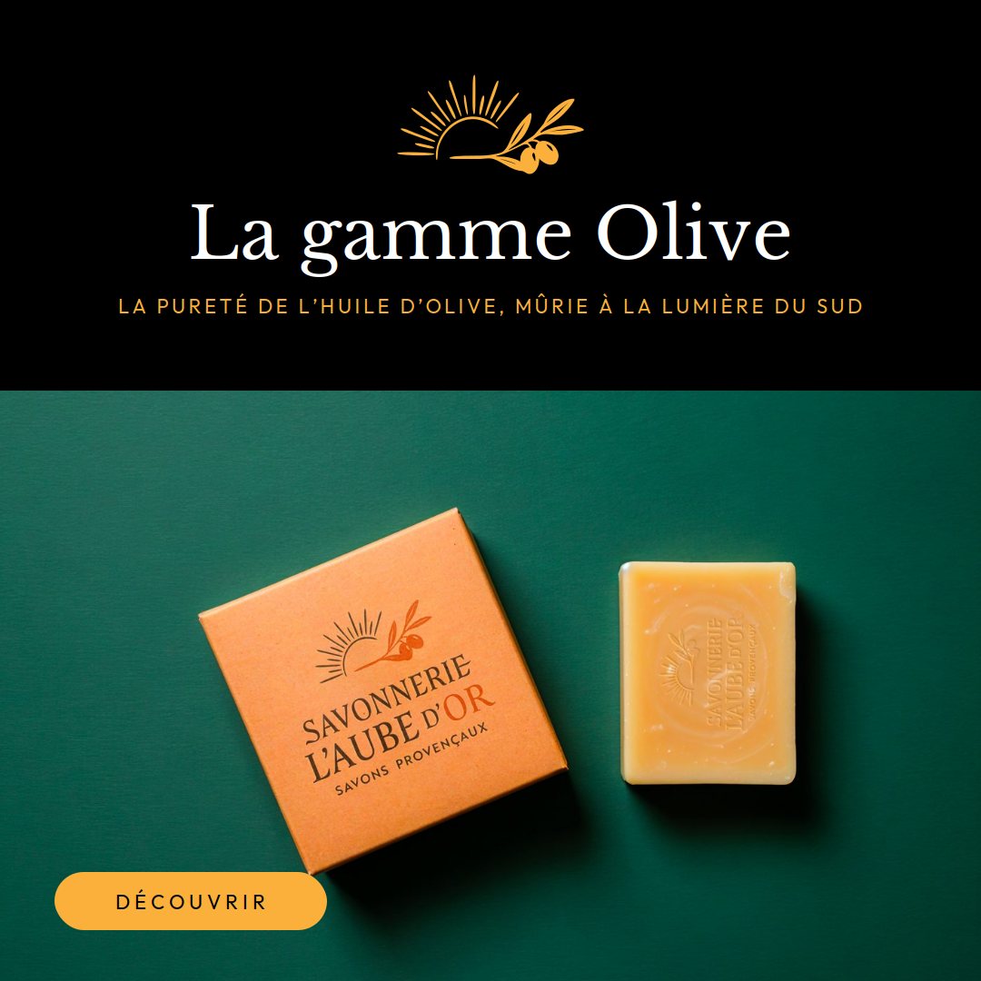
Post · Olive range
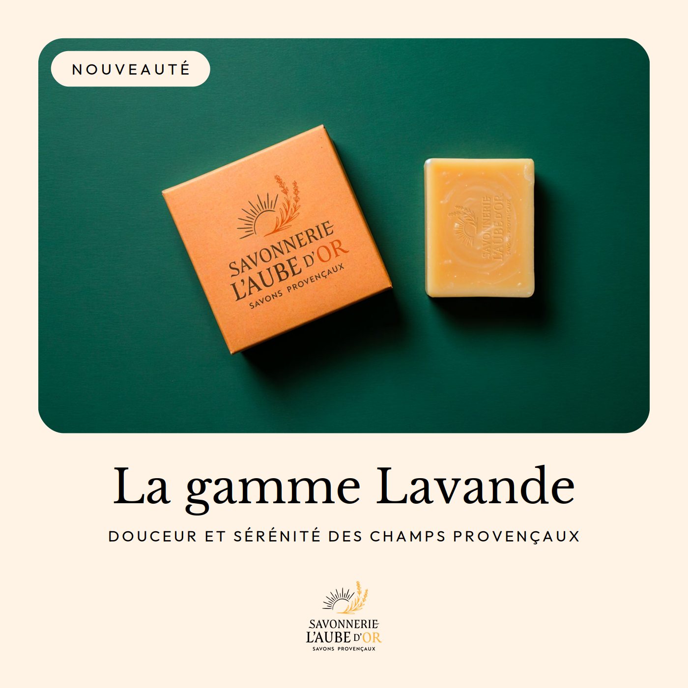
Post · Lavande range
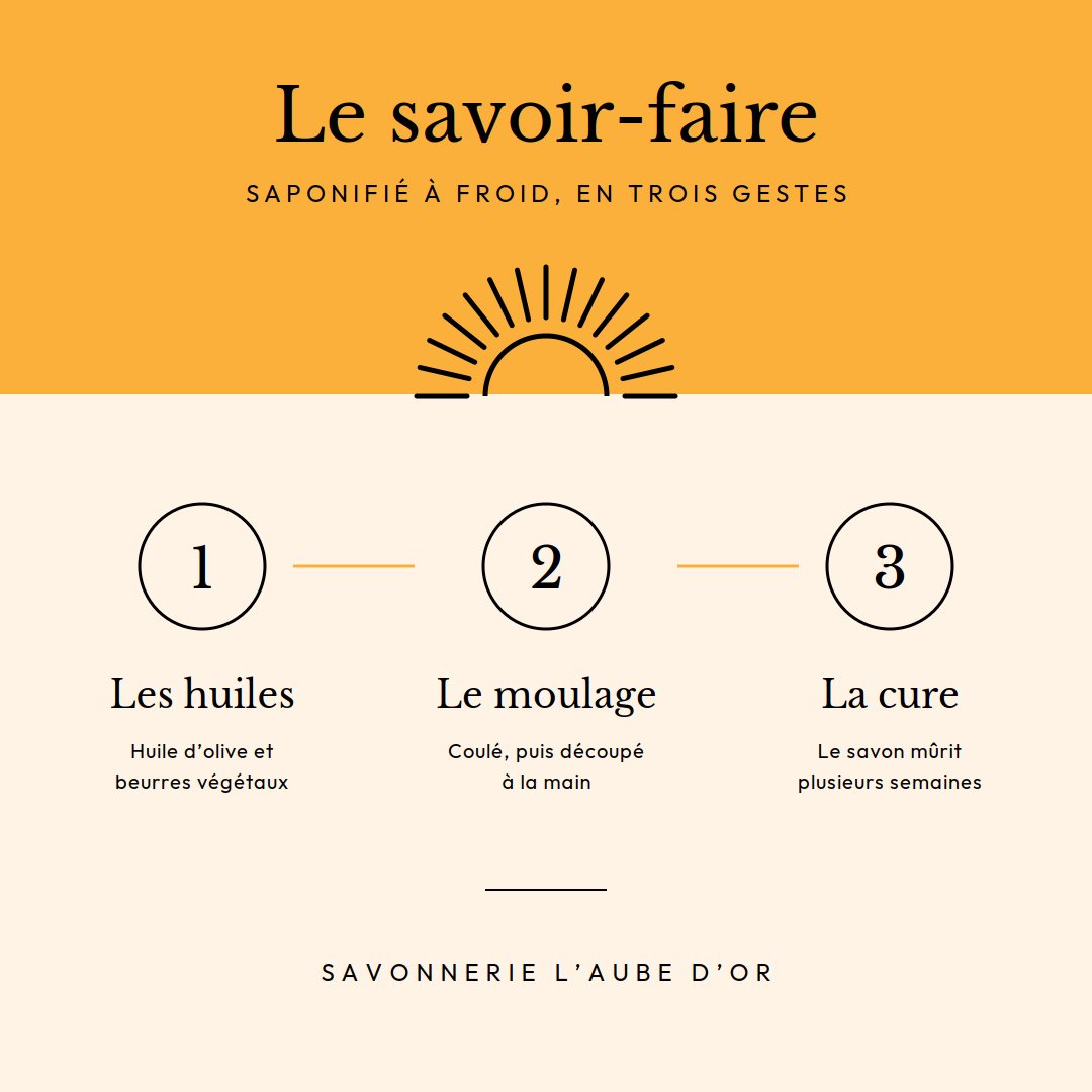
Post · Craft
Print & web
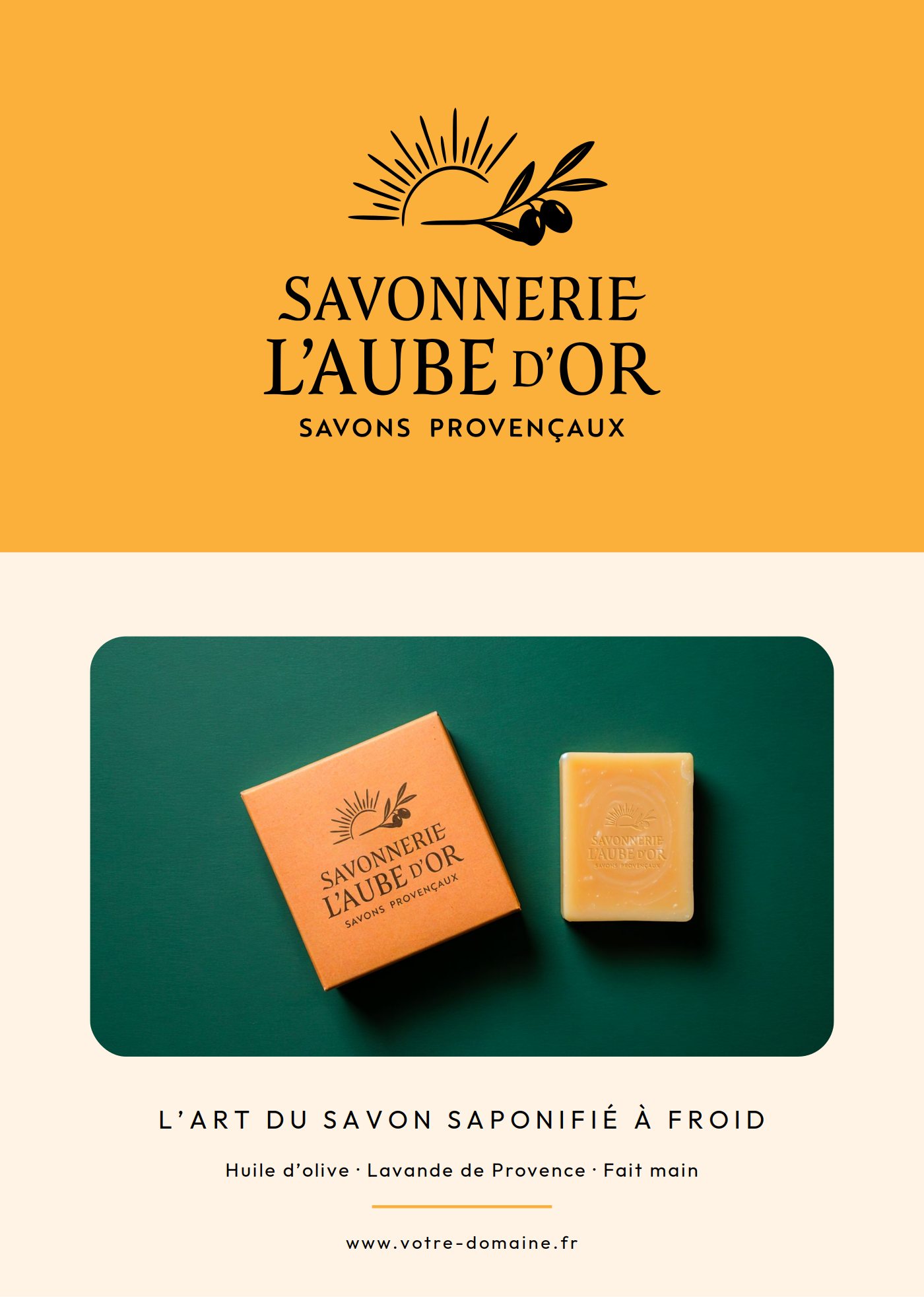
Flyer A5
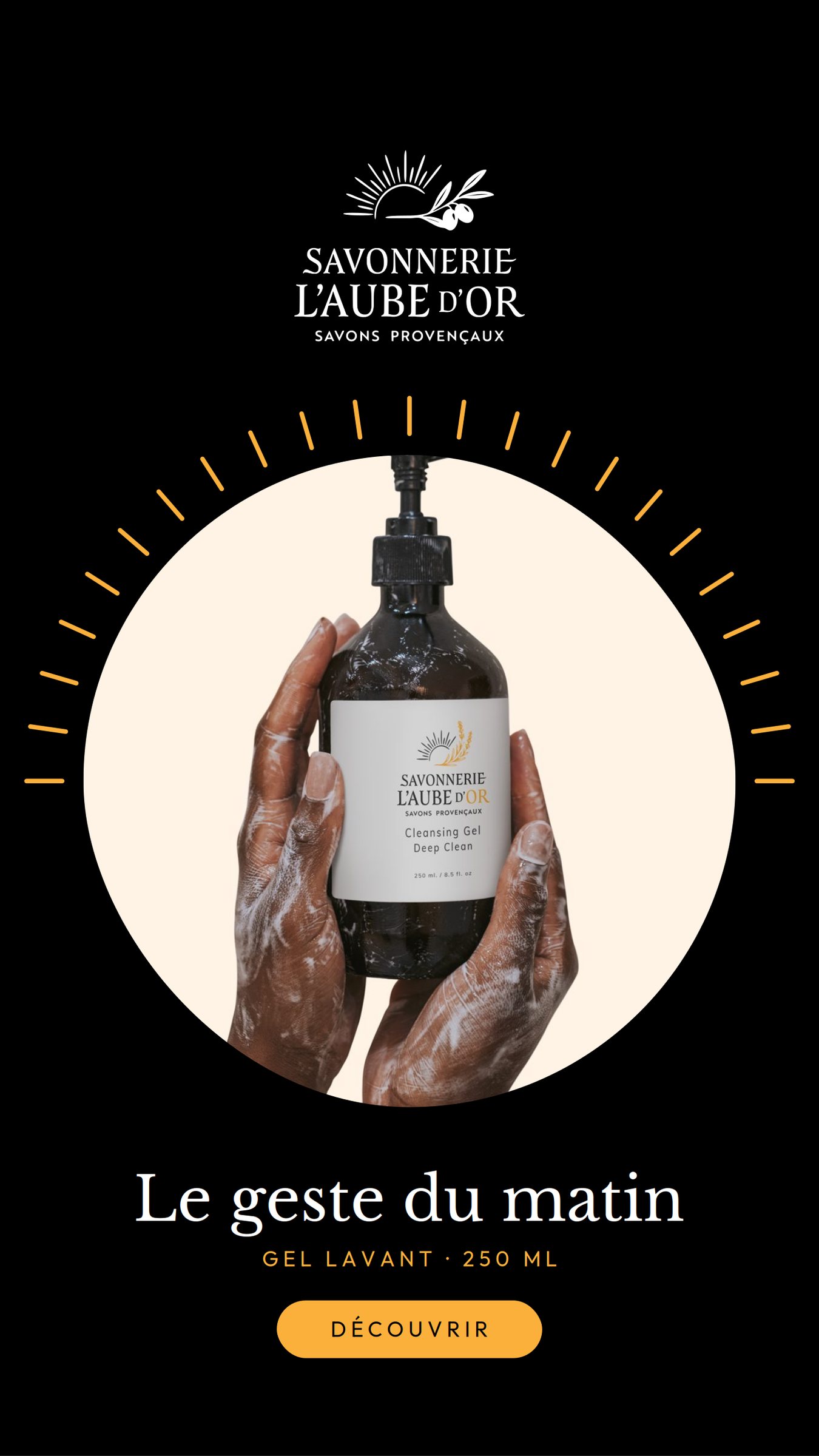
Product story
Stationery & variations
Business card · front
Business card · back
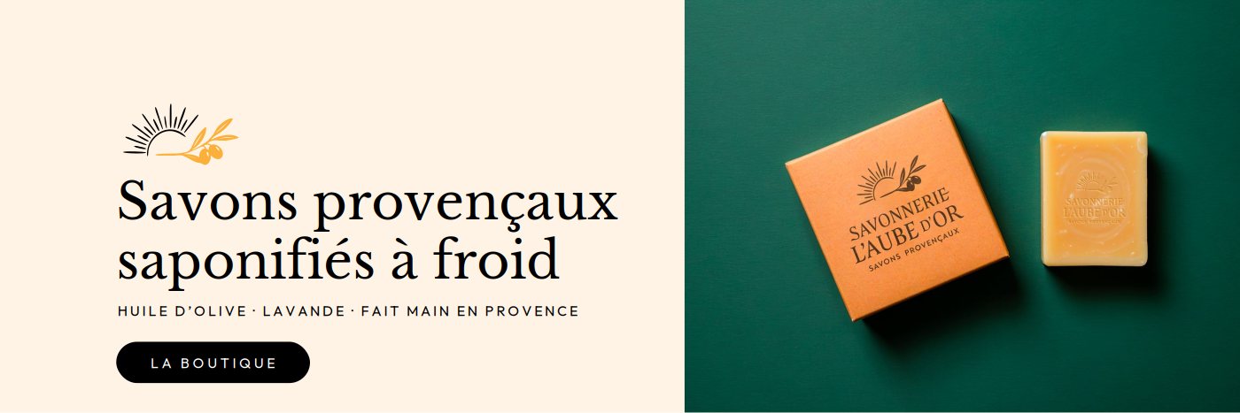
Web banner
60 mm sticker